An interactive planning tool that helps marketing teams evaluate budget decisions before applying them live

Intro
Marketing teams constantly make decisions about where to invest their budget. But understanding how those changes might affect future performance often required manual analysis, spreadsheets, or expensive real-world testing.
Media Forecasting helps users simulate different budget scenarios, compare projected outcomes, and estimate their impact before updating the plan.
This project was created as part of my work on a B2B marketing platform. The work presented here reflects my personal contribution and perspective as a designer.
Project at glance
Product: Large B2B marketing platform
Timeline: 2023–2024
Role: Design owner
Scope included:
planning workflow and information architecture
interactive forecasting experience
budget simulation and scenario exploration
monthly planning breakdown
bulk simulation across multiple campaign groups
edge cases and forecasting feedback
Challenge
The goal of Media Forecasting wasn't simply to generate predictions—it was to make those predictions useful during everyday planning.
Users needed a faster way to evaluate budget changes before applying them to their Media Plan. Instead of relying on spreadsheets, manual analysis, or trial and error, they needed an experience that helped them understand how different decisions could affect future performance.
From a design perspective, the project started from scratch. There were no established interaction patterns for this type of planning experience, so every part of the workflow had to be explored and designed specifically for this product.
The experience needed to help users:
understand how budget changes affect projected performance
identify opportunities to increase or optimize spending
compare different budget scenarios before updating the Media Plan
work efficiently across dozens of campaign groups
understand when forecasts could be trusted—and when they couldn't
Rather than presenting another planning table, the goal was to create an interactive experience that made forecasting easier to understand, easier to explore, and easier to act on.

The layout: designing the workflow before designing the interface
The first concepts naturally started with a table. Since planning data is inherently tabular, it seemed like the most familiar way to organize the experience.
As the exploration progressed, it became clear that the table was solving the wrong problem.
Users weren't trying to compare rows of numbers. They wanted to understand the relationship between budget and projected performance, explore different scenarios, and quickly decide whether changes were worth making.
That shifted the design away from a spreadsheet-first approach toward an experience centered around forecasting itself.
The final layout was organized into several layers:
selecting a Media Plan as the forecasting data source
filtering campaign groups
exploring forecasts within individual groups
reviewing the overall impact before updating the Media Plan
Since Media Plans could contain dozens of campaign groups, every group remained collapsed by default except the first one. This kept the interface easy to scan while still allowing users to dive deeper whenever they needed more detail.
A sticky footer summarized the total simulated impact across all groups and became the final step before updating the connected Media Plan.
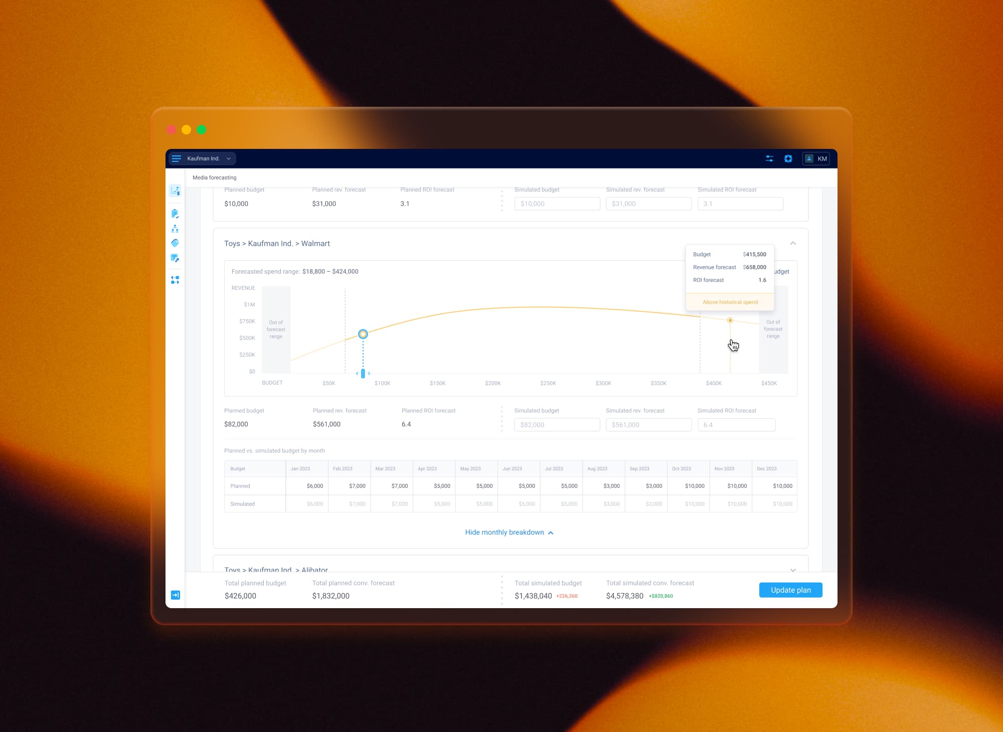
Turning forecast data into actionable decisions
The forecast curve became the center of the experience.
Rather than asking users to interpret projected values manually, it visualized the relationship between budget and projected revenue, helping them understand not only what would happen after changing the budget, but also whether the current budget was already well positioned.
Every forecast displayed:
the current planned budget
the simulated budget
projected revenue and ROI
the optimal budget zone
This made it possible to immediately identify whether a campaign had room to grow or was already beyond its optimal investment point.
To support different planning styles, users could either enter values manually or interact directly with the forecast curve. Every change updated the simulation instantly, keeping the relationship between spend and projected performance easy to understand.
The experience also introduced contextual indicators such as Growth opportunity and Requires attention, helping users quickly identify campaigns that deserved further investigation before making changes.
Instead of acting as a static visualization, the forecast became an interactive decision-making tool.
Supporting monthly planning without adding complexity
Forecasts were generated for the overall budget, but planning decisions often required monthly adjustments before changes could be applied back to the Media Plan.
The challenge was introducing that additional level of detail without overwhelming the primary forecasting experience.
Rather than exposing another large planning table by default, I embedded a monthly breakdown inside each campaign group and kept it collapsed until users needed it.
Once expanded, users could adjust the budget distribution across individual months while keeping the overall simulated budget unchanged. As values were edited, the remaining months automatically recalculated to preserve the total allocation.
This approach allowed users to refine monthly planning without interrupting the overall forecasting workflow.
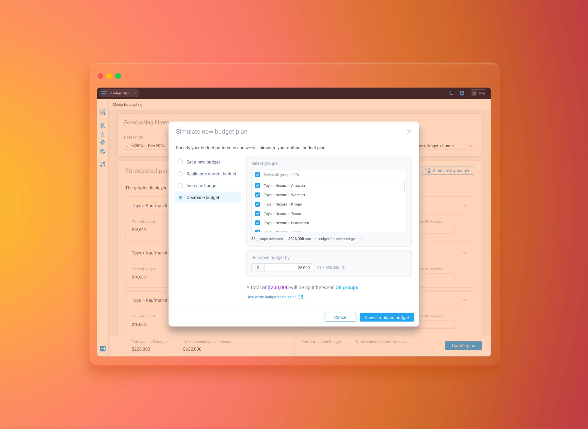
Bulk simulation: exploring budget scenarios across multiple campaign groups
While individual forecasting worked well for single campaigns, planning often required updating many campaign groups at once.
Instead of asking users to repeat the same actions dozens of times, I designed a bulk simulation workflow built around the most common planning scenarios identified during research.
Users could:
set a new budget
increase the current budget
decrease the current budget
reallocate the existing budget
Rather than manually editing every campaign group, users simply selected their intention and the affected groups. The system then calculated and distributed the budget automatically while preserving a transparent review process.
Each step introduced only the information needed at that moment—from selecting groups and reviewing supported forecast ranges to understanding how the budget would be distributed before applying the simulation.
Once applied, every affected campaign group was clearly marked, making it easy to distinguish bulk-generated values from individually simulated ones.
Helping users understand forecast limitations
Forecasts are only valuable when users understand how much confidence they can place in them.
Instead of hiding the model's limitations, the experience surfaced them directly within the forecasting workflow.
When simulations moved beyond historical data, forecasts remained available but clearly communicated that predictions were now based on extrapolation.
When budgets exceeded the supported forecasting range, the interface stopped presenting unreliable projections and explained why a forecast could no longer be generated.
These states were communicated consistently across the curve, supporting messages, and summary values, allowing users to understand not only the result itself but also how reliable that result was.
This helped build confidence without interrupting the planning process.
Results and product impact
Media Forecasting transformed complex forecasting into an interactive planning experience where users could understand current budget allocation, explore alternative scenarios, and estimate their impact before updating their Media Plans.
Instead of relying on spreadsheets and manual analysis, marketing teams could evaluate different investment strategies through a workflow designed specifically for planning and decision-making.
From a product perspective, the feature became an important part of the broader Media Planning experience and continued to evolve after launch with additional forecasting capabilities.
From a design perspective, this project was about much more than designing charts or tables. It required finding the right balance between analytical depth and usability, turning predictive models into intuitive interactions, and helping users make confident decisions without hiding the complexity behind the data.
It reinforced several design principles that continue to influence how I approach complex B2B products:
design workflows before individual screens
help users understand the current situation before asking them to make decisions
use interaction to explain complex data rather than simply display it
make system limitations visible instead of hiding uncertainty
reduce repetitive work by letting the system handle complexity wherever possible