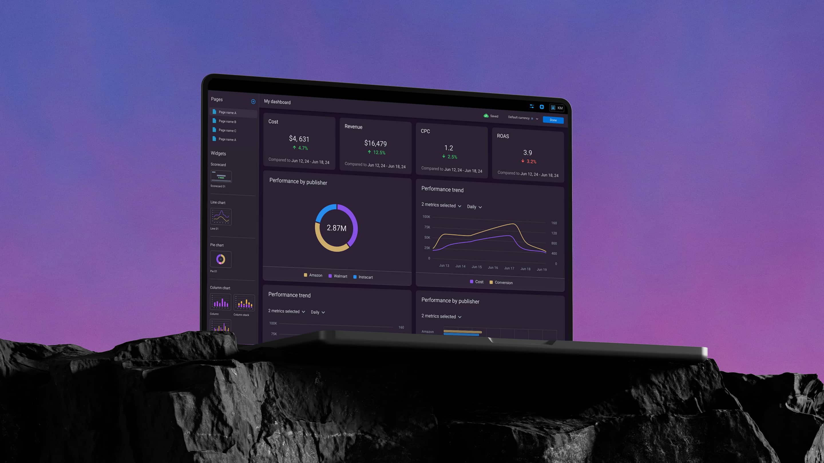
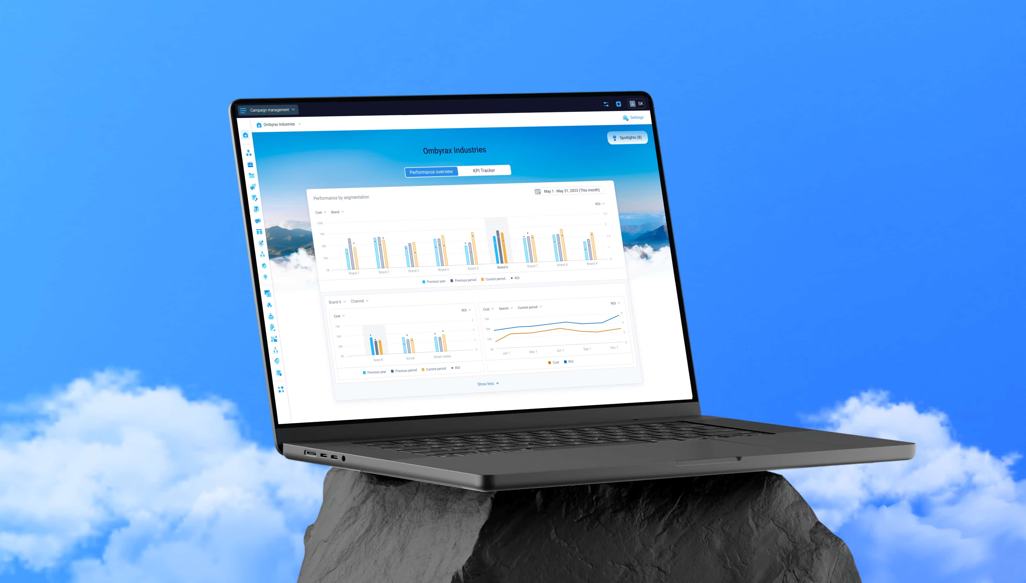
A customizable executive workspace designed to improve the monitoring experience
Intro
Marketing leaders had access to plenty of data, but the story behind it was scattered across reports, dashboards, and different sources. As a result, executives struggled to quickly understand what was happening, whether performance was on track, and where attention was needed.
Executive Workspace was designed to bring those signals into one place.
This project was created as part of my work on a B2B marketing platform. The work presented here reflects my personal contribution and perspective as a designer.
Project at glance
Product: B2B platform
Timeline: 2022–2024
Role: Design owner
Scope included:
Workspace structure and information hierarchy
Drill-down patterns for monitoring and analysis
KPI tracking connected to planning data
Settings architecture and saved views
Spotlights integration into the workspace
Challenge
The challenge was not simply to surface more executive data. It was to turn fragmented reporting into a workspace that could be understood within seconds, while still staying flexible enough for different organizations, KPIs, and planning structures.
One design partner described the perfect experience like this:
Ideally, I should understand the full picture in around 30 seconds.
That became a useful benchmark for the project. The workspace needed to help executives quickly answer three questions:
What’s happening?
Are we on track?
Where should I pay attention?
At the same time, it had to avoid becoming a rigid, one-size-fits-all dashboard. Different teams monitored different metrics, segments, and planning setups, so the solution needed to balance speed of reading with flexibility of configuration.
Structuring the workspace
A natural first idea was to put everything into one large dashboard. But partner sessions revealed that executives were actually coming with two different jobs to be done:
What’s happening? Explore performance, compare segments, and understand what changed.
Are we on track? Check performance against goals and see whether anything needs attention.
Trying to solve both scenarios in one interface made the experience harder to read and harder to navigate. To keep the workspace focused, I split it into two distinct modes:
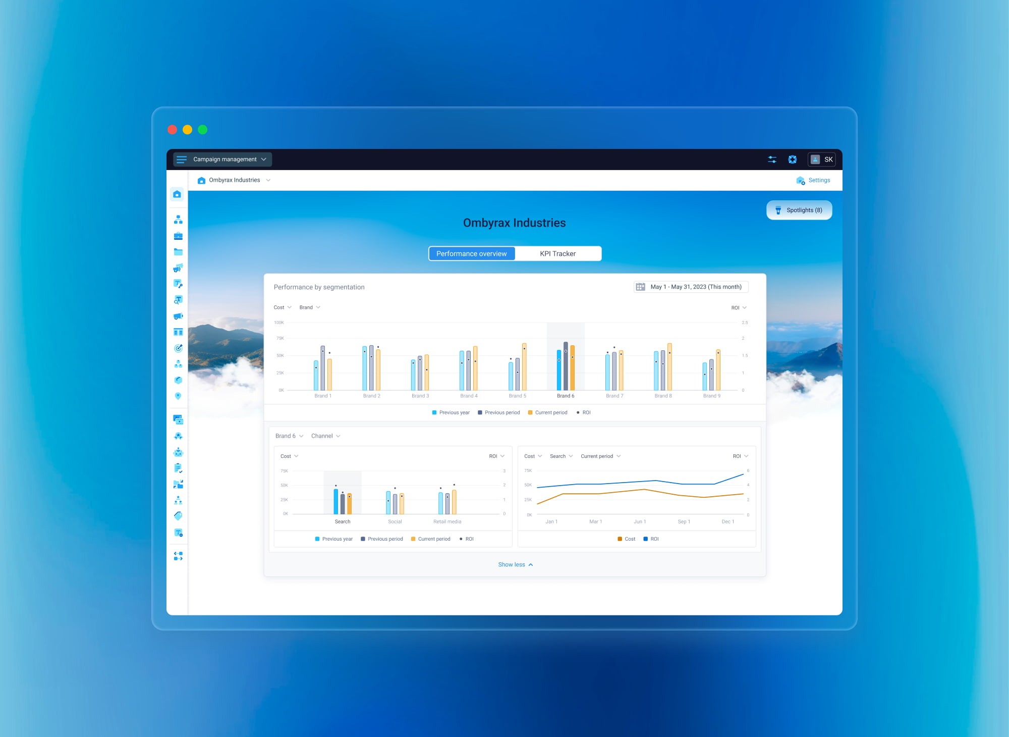
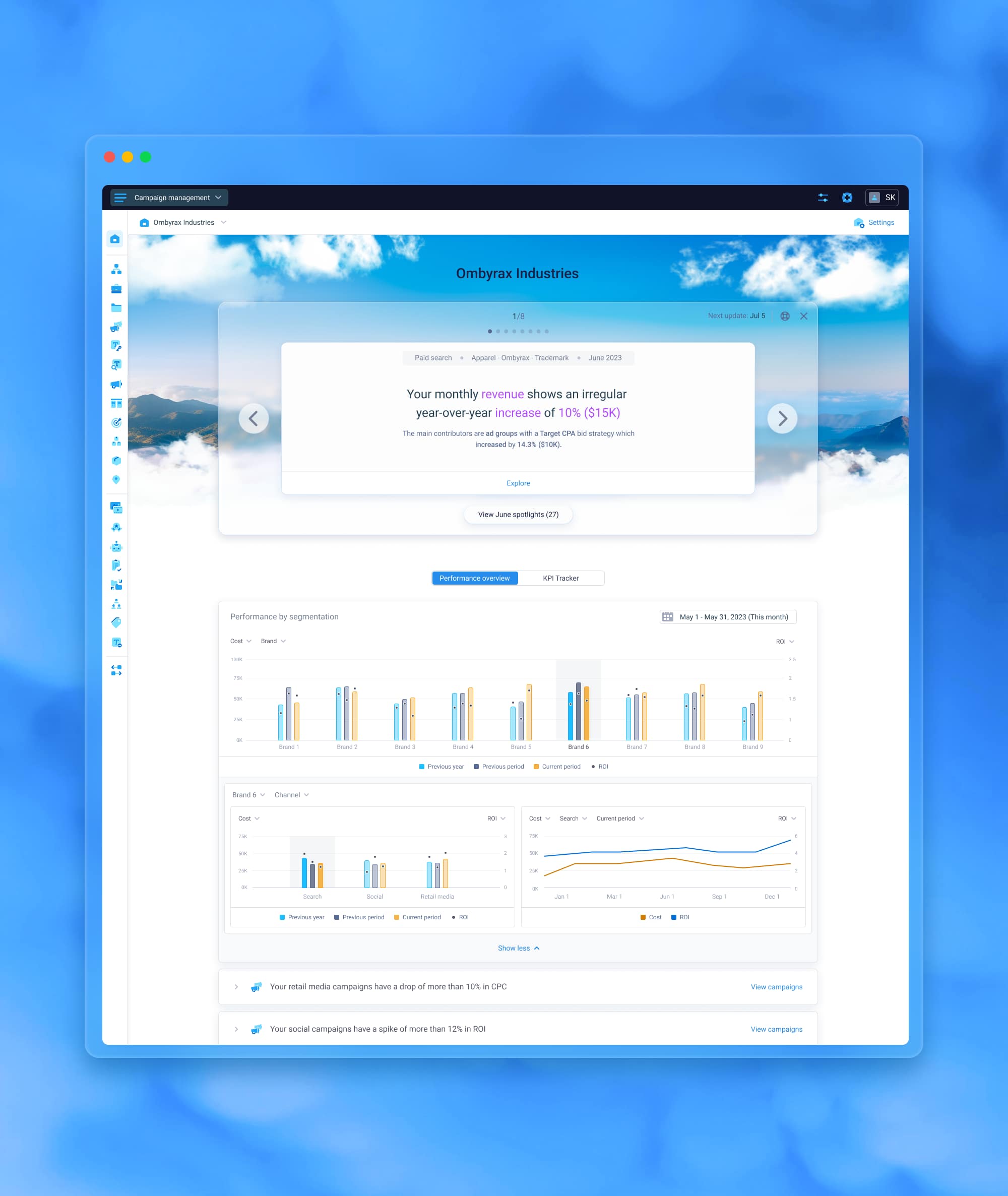
Performance Overview — Built for exploration and comparison.
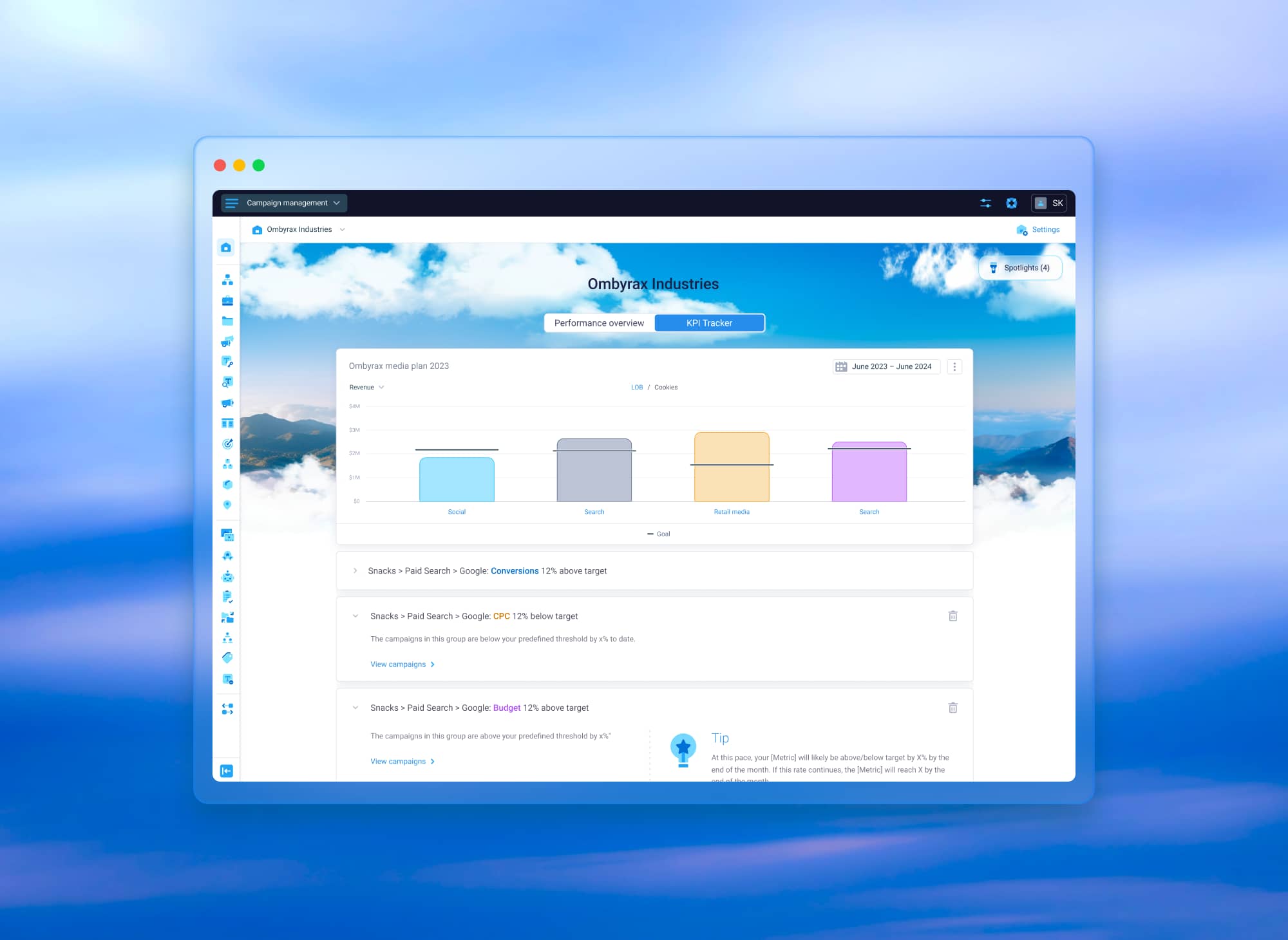
KPI Tracker — built for quick status checks against goals.
Each mode got:
• its own information hierarchy
• its own drill-down logic
• its own alerting behavior
The second structural decision was separating configuration from monitoring. Executives opening the workspace in the morning are there to read, not configure. Configuration is a different task with a different mindset, so I moved it into a dedicated Settings layer.
This decision helped in two ways:
it kept the main workspace focused on fast monitoring rather than setup;
it gave teams the flexibility to adapt the experience to their own KPIs, segments, and planning structure without overloading the executive surface.
Performance Overview: drilling in without losing context
Performance Overview was designed for exploration. The main challenge here was density: executives needed to investigate performance shifts without losing the top-level picture.
A standard pattern like opening a separate page or modal on click felt too disruptive, because it forced the user to reorient every time they went deeper. Instead, I designed an expandable widget with multiple levels of drill-down inside the same component. The interaction worked like this:
the top chart acted as the entry point
each next level expanded from the previous one
segments and metrics could be switched directly inside the widget
users could drill in and back out without leaving the original context
This pattern made exploration feel lighter and preserved the high-level view even while going deeper. Instead of moving users across separate pages, it kept the investigation anchored in one place.
KPI Tracker: different scenario, different pattern
KPI Tracker looked related to Performance Overview, but the actual use case was different. Here, the goal was not to compare multiple segments side by side. It was to quickly answer:
Are we on track?
Where exactly is the issue if we’re not?
Because of that, reusing the same drill-down pattern would have added unnecessary complexity. Instead, I used a breadcrumb-based drill-down that fit the task better. That pattern worked well because:
users only needed to focus on the current level
top-level context did not need to stay visible at all times
the structure supported quick movement from summary to root cause
KPI Tracker was also connected to a planning source:
goals and target values came from a connected Media Plan
alerts were informed by the same source
the experience focused on monitoring performance against predefined targets rather than broader performance exploration
This made KPI Tracker a distinct monitoring surface rather than a simplified version of Performance Overview. It served a different decision-making need and therefore required a different interaction model.
Designing the visual foundation
Because Executive Workspace served as a home surface for executive users, it needed to feel more intentional than a standard reporting page without distracting from the data.
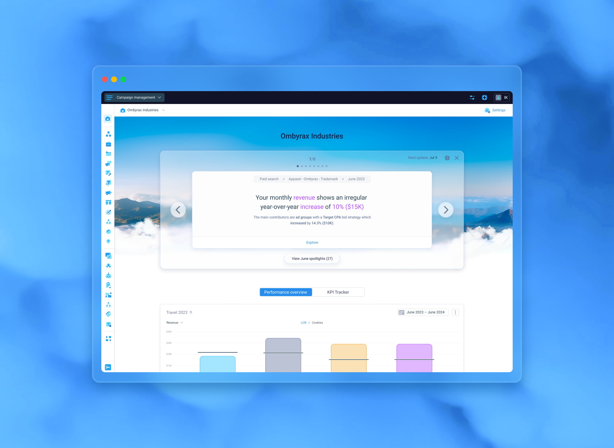
We designed a lightweight visual foundation around a landscape image with animated cloud layers. It helped:
give the workspace a more polished home-surface feel
introduce depth without competing with the content
visually align the experience with another homepage surface in the product
The motion was subtle and paused on hover to avoid distraction.
Integrating Spotlights into the workspace
Spotlights started as a separate experience and were later brought into Executive Workspace as the highest-priority signal layer. This created a structural challenge: the workspace already had an established hierarchy with tabs and widgets, so the question became where to place a new top-level signal without breaking that hierarchy.
I placed Spotlights above the tabs as a dedicated card zone. That solved two things:
it preserved their priority by making them the first thing users saw;
it avoided mixing them into the existing tab structure, where they would compete with regular monitoring widgets;
Because Spotlights were reviewed periodically rather than continuously, I also added a collapse pattern:
the section could be hidden after review
a floating button allowed users to bring it back when needed
the workspace stayed focused without losing access to the content
Spotlights also appeared as banners of different sizes, so I created a shared visual language based on a glass material. That helped these variations feel like one coherent system rather than unrelated components.
Settings: the control layer
Separating Settings from the main workspace solved an important product tension: executives needed a simple reading surface, while organizations still needed flexibility behind the scenes.
Settings became the layer where the workspace was actually shaped. It allowed users to configure:
scope
segments
metrics
alerts
Media Plan connection for KPI Tracker
It also introduced multiple saved views, which was important because different organizations wanted to monitor different slices of the business.
Each view could preserve its own configuration, so users could:
switch between business contexts in one click
keep the main workspace clean and fast to read
avoid turning the primary executive surface into a heavy configuration environment
This separation helped the product support different reporting structures without compromising the simplicity of the main monitoring experience.
Outcome
Executive Workspace turned fragmented reporting into a dedicated executive-facing surface where users could quickly understand:
how performance was trending
whether goals were on track
where attention was needed
Instead of piecing the story together across multiple reports and sources, executives could monitor the business from one workspace designed specifically for fast reading and decision support.
From a product perspective, the initiative helped establish a stronger executive layer in the platform by:
consolidating key monitoring signals into one executive-facing experience;
supporting both exploration and goal tracking through separate monitoring modes;
allowing different teams to adapt the workspace through saved views and flexible configuration;
creating a scalable structure for future additions such as Spotlights, alerts, and additional monitoring surfaces;
It also supported broader product goals around executive engagement and retention by giving leadership teams a clearer, more focused way to monitor business performance.
From a design perspective, the project was largely about structuring complexity: deciding what should stay visible, what should be configurable, and which interaction model best fit each monitoring task.
It reinforced an important principle for data-heavy B2B products:
surface the most important signals first
keep the hierarchy clear
support deeper exploration only when it adds value
separate reading from configuration when the two require different mental modes