Dark mode
Bringing dark mode into an existing design system
Overview01 — 07
Adapting the platform for a second theme
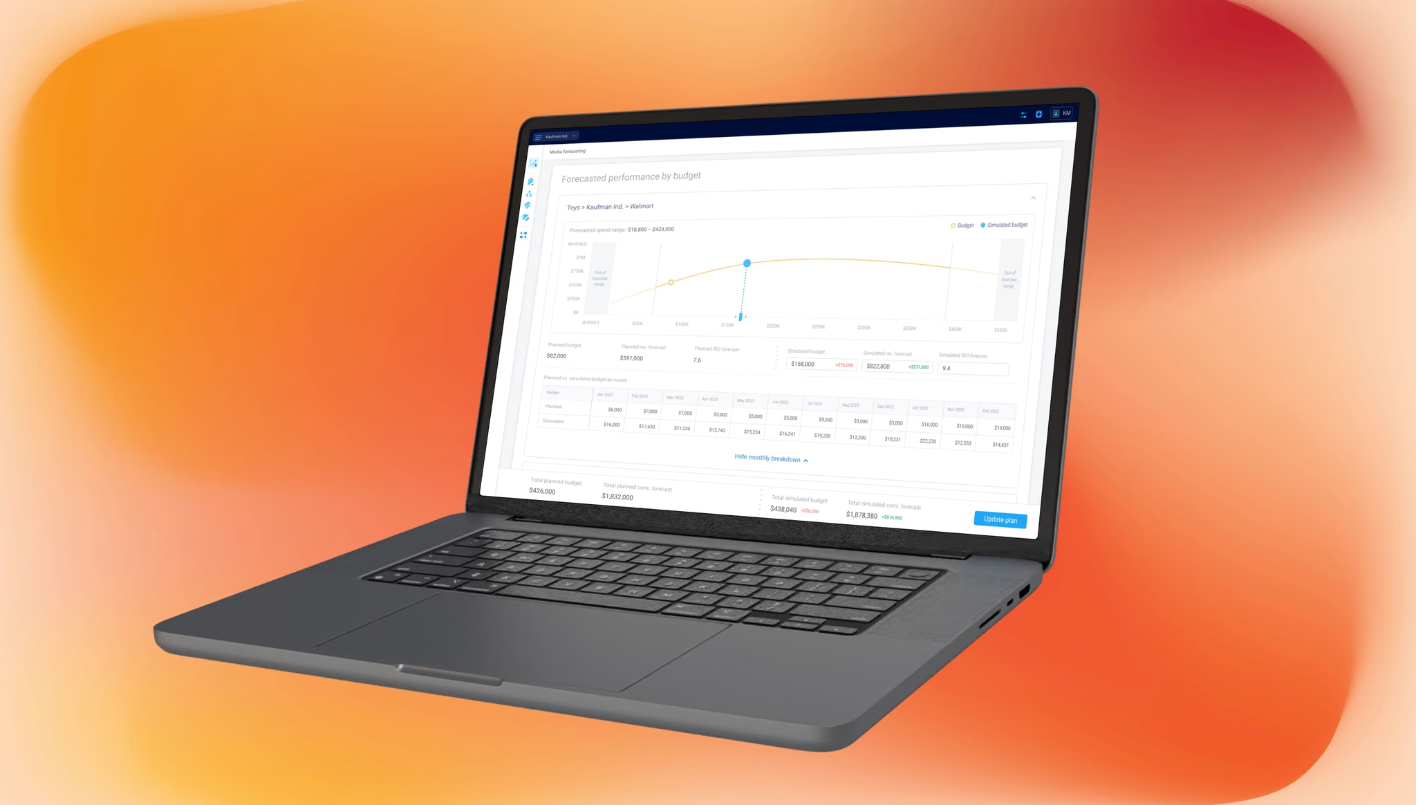
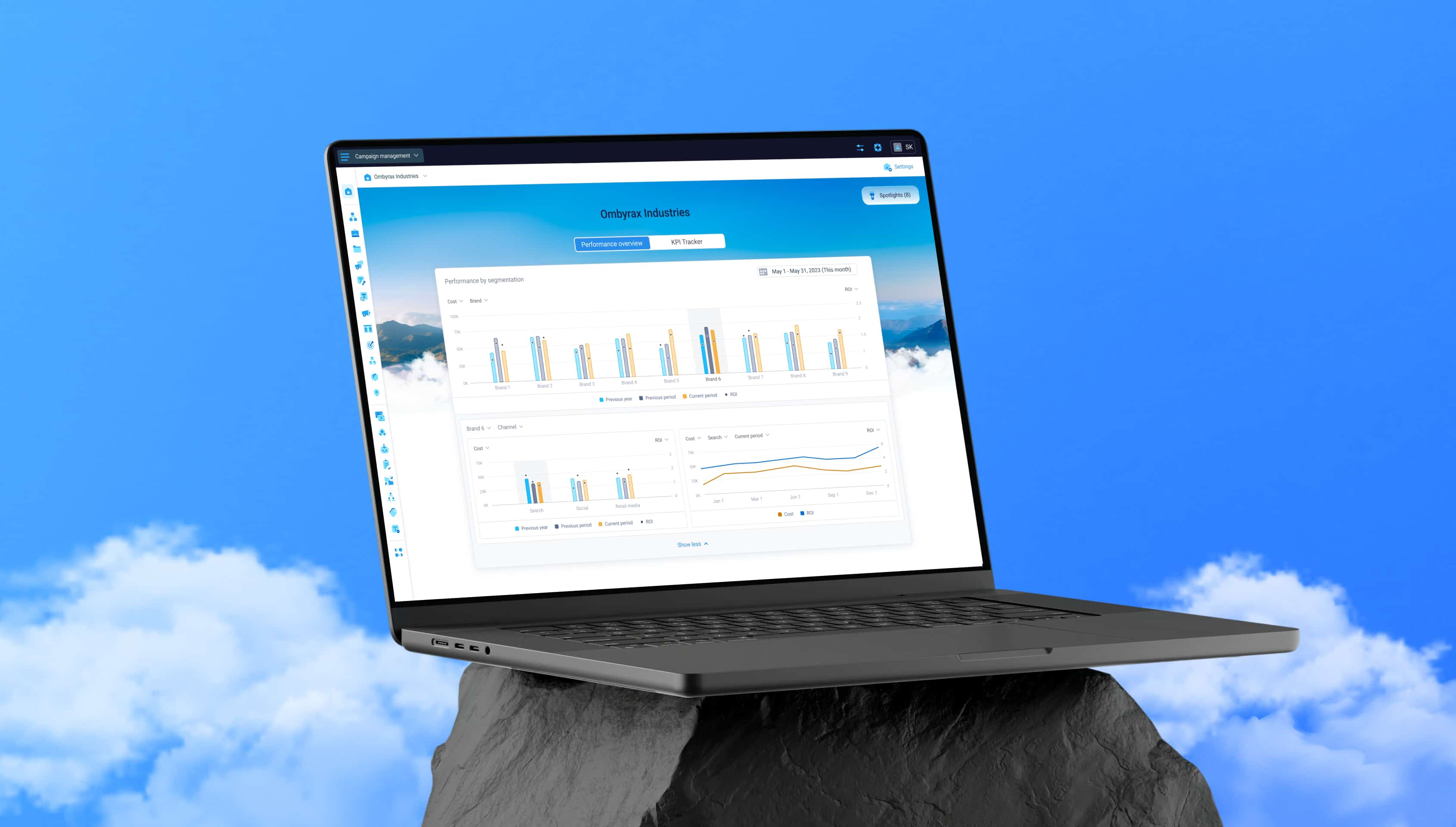
Dark mode was introduced after the product and its design system were already well established. The interface had been built around light backgrounds and white surfaces, so the new theme had to work within a structure that was already in place, not replace it.
Together with another designer, I explored how the same components, layouts, and information hierarchy could hold up in a darker environment across different areas of the platform.
Created as part of my work on a large B2B marketing platform. This case reflects my contribution and perspective as a designer.
Product
B2B marketing platform
Timeline
2025
Role
Product designer
Collaboration
Another product designer, with feedback from the wider design team
Scope
Theme exploration, visual direction, interface hierarchy, materials, and application across core product screens
Challenge02 — 07
Preserving the hierarchy of a light-only interface
White surfaces did a lot of quiet work in the existing interface: they defined cards, grouped related content, and separated one level of the page from the next. Moving to dark mode changed those relationships on every screen we tested.
A screen-by-screen redesign wasn't an option. The new theme had to run on the existing component logic and keep development and QA manageable across a platform this size.
Exploration03 — 07
Testing the existing UI logic
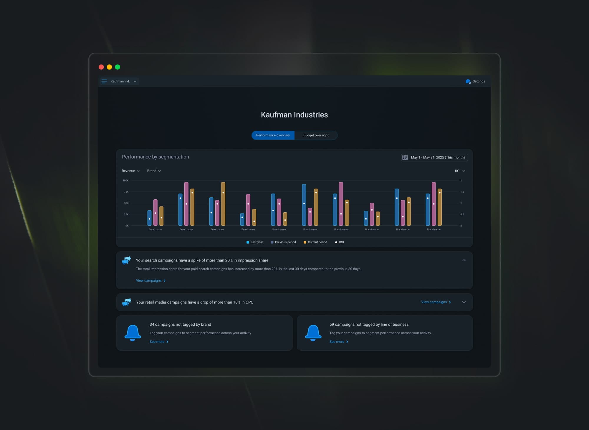
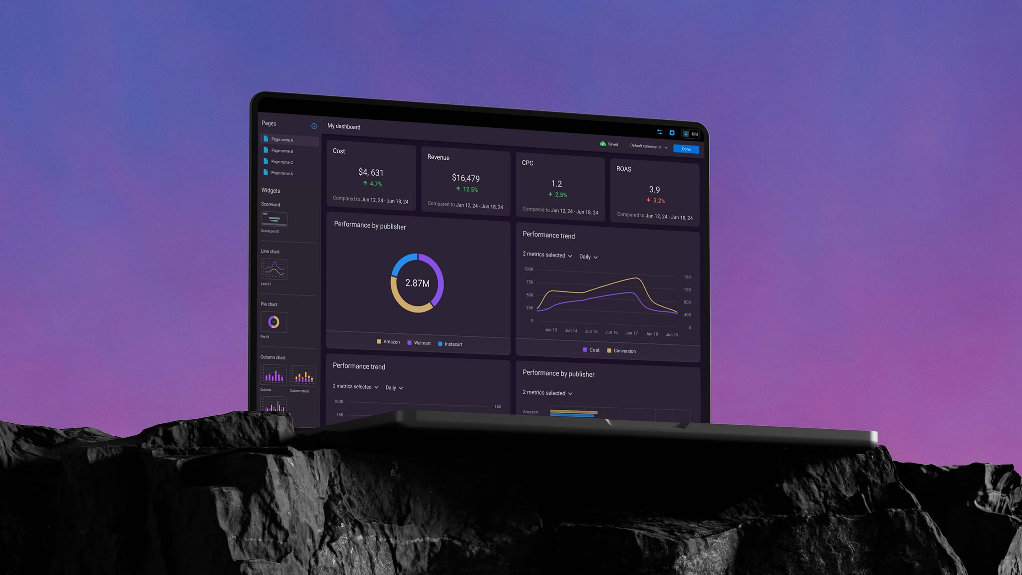
We picked screens with different structures and levels of density and translated them into dark mode by hand, to see whether the relationships between page backgrounds, sections, cards, and data would still read clearly once the base colors flipped.
The hierarchy held up across every example. That meant we could keep the existing layouts and components as they were and put the real work into color and surface behavior instead of a structural rebuild.
Direction04 — 07
Defining the right tone
Once we knew the existing logic could support a second theme, the next question was tone. We explored several directions and, for a while, considered letting people choose between them.
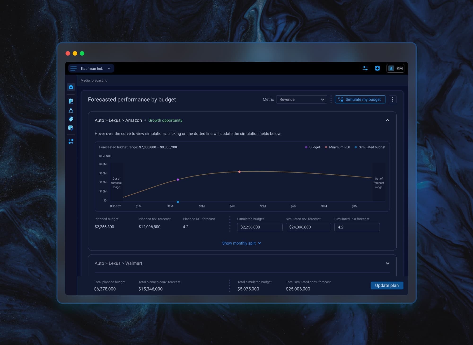
That option didn't survive contact with the timeline: supporting multiple tones would have multiplied the states the team needed to build and test, so we narrowed the direction down to one. The final comparison came down to two candidates, Dark Blue and Asphalt, and the team was genuinely split.
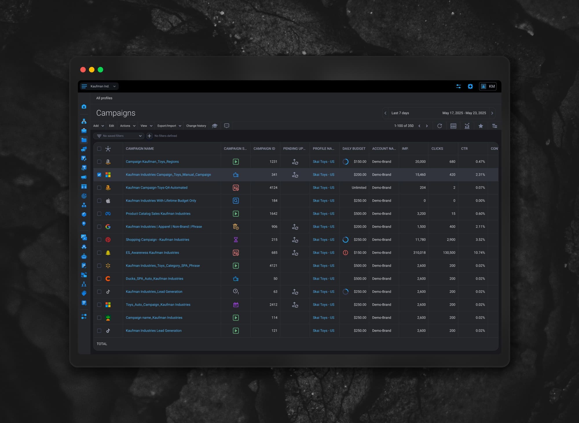
I was in the Asphalt camp. It read as more neutral and worked across a wider range of existing screens. Dark Blue looked striking in an individual mockup, but felt too dominant as the one default theme the whole product would run on.
Decision05 — 07
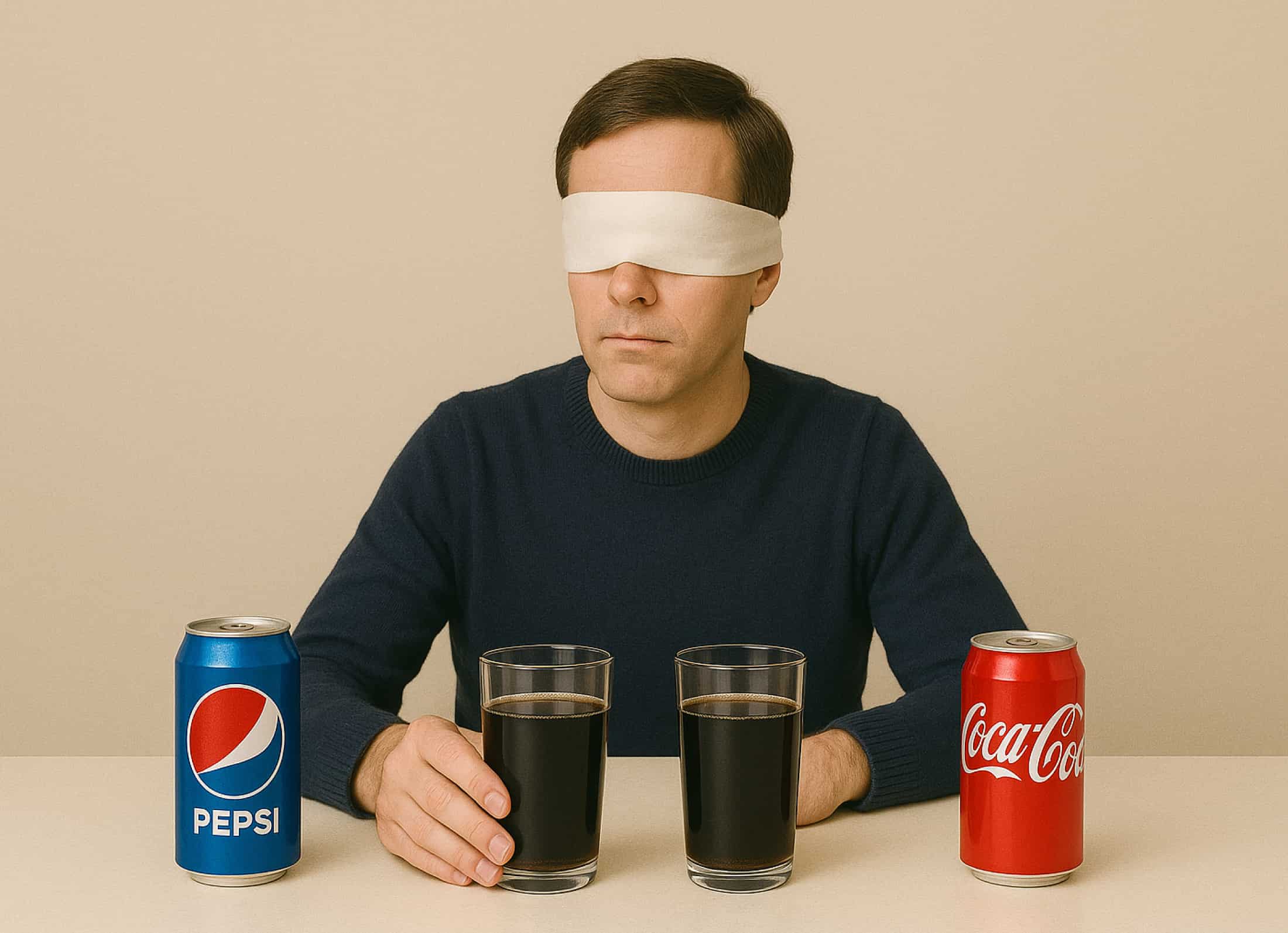
The Pepsi vs. Coca-Cola argument
During one review, another designer on the team compared the decision to the Pepsi Challenge — the blind taste test where Pepsi often won the first sip because it tasted sweeter, while Coca-Cola stayed the drink most people kept choosing over time.
The analogy fit our comparison closely. Dark Blue stood out immediately in a side-by-side presentation, the way a first sip does. Asphalt was quieter and more comfortable across dozens of screens — closer to something you'd actually want to live with.
Since people would see the selected tone every day, not just in a mockup review, I saw Asphalt as the safer default.
Solution06 — 07
Introducing a glass-based surface
Looking back at how the light theme was actually constructed, I focused on the white sections used throughout the product to define cards and content areas. Giving every one of those sections the same solid dark fill would tie them to one specific background tone — exactly the flexibility we'd just decided we needed to avoid.
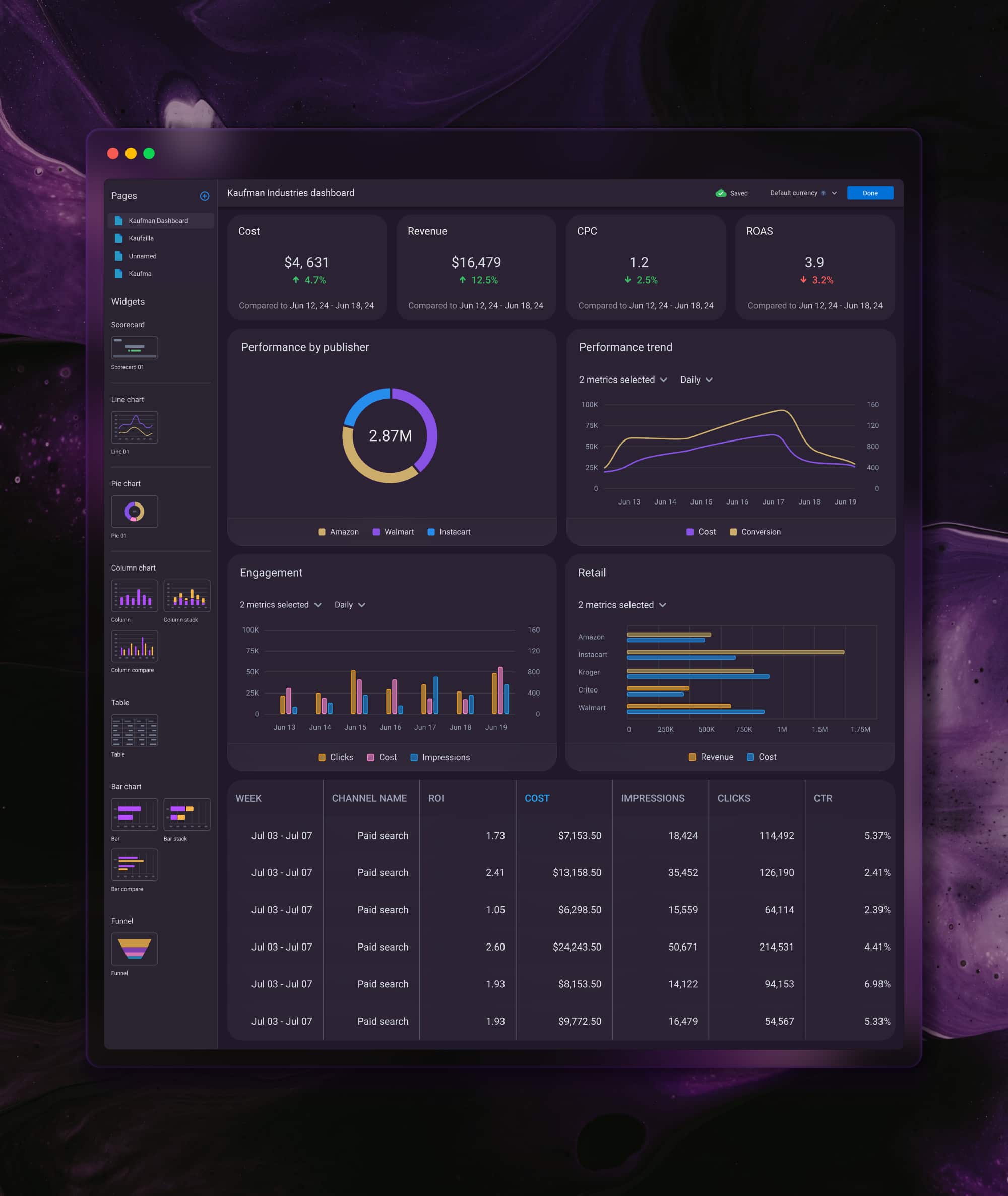
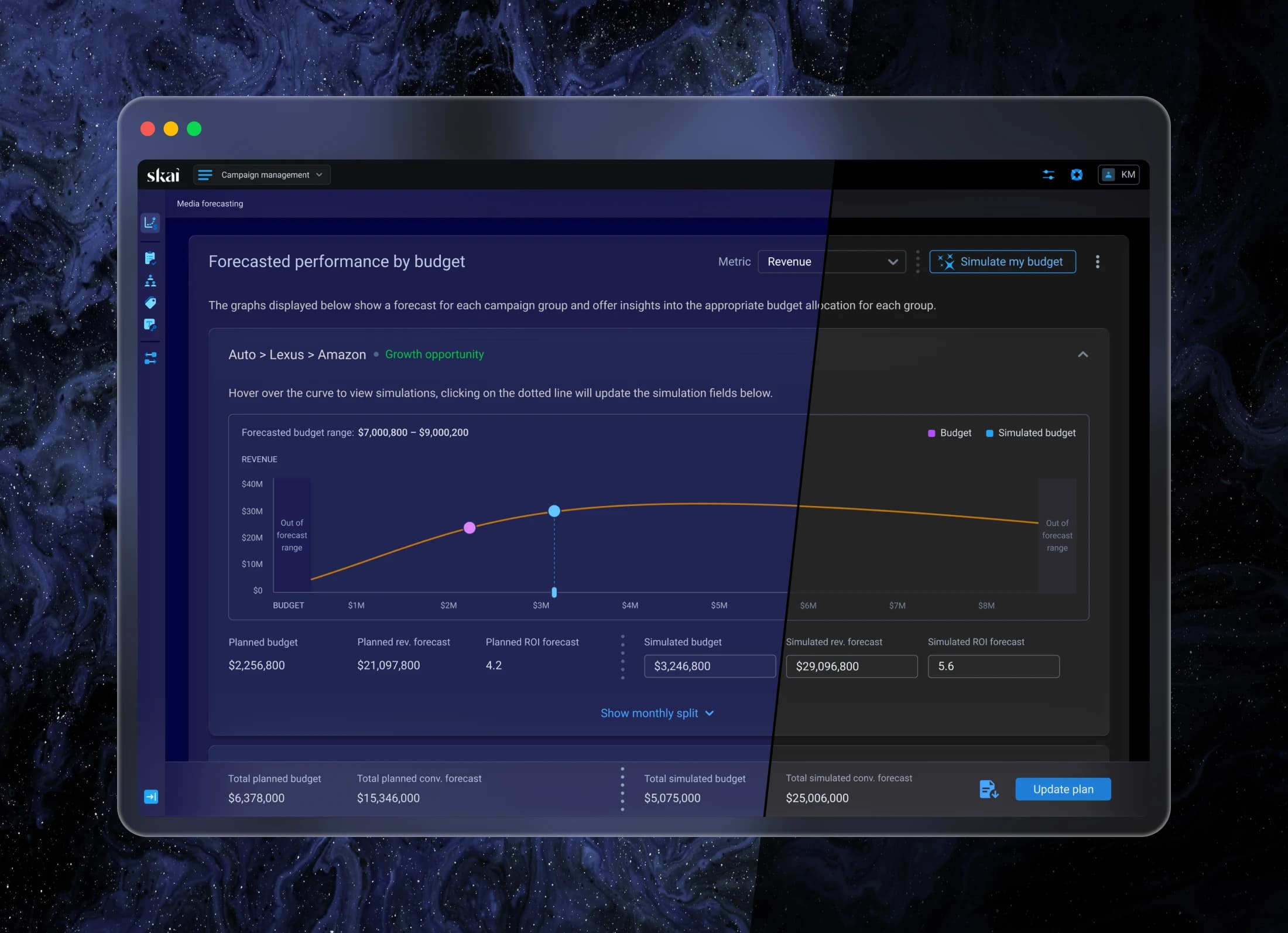
I tested a different surface style instead: slightly transparent, with a strong background blur. The sections still separated content the way they always had, but the page background stayed visible underneath them.
That let us define the change as one additional component style and control the overall tone through the page background alone. The component changes stayed limited, and the theme itself became more flexible than a straight color swap would have allowed.
Outcome07 — 07
A dark theme built on the existing system
The final direction paired Asphalt as the base background with the new glass-based surface for the main sections. Existing layouts and information hierarchy stayed exactly where they were, and the interface picked up its own dark visual language on top of them.
Keeping one default theme limited the extra development and QA work. And because the main sections were no longer tied to an opaque fill, the background itself could be adjusted later without reworking a single container.
For me, the strongest part of the solution was its practicality. It changed the visual character of the product through one additional surface style, and left the system underneath completely intact.